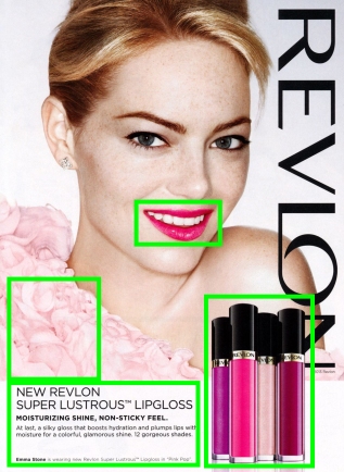
Advertisement
Today’s spotting is an advertisement from Revlon. Featuring Emma Stone and New Revlon Super Lustrous Lipgloss.

Revlon Story
The company started in 1932 with the first fingernail polish that was not clear or transparent. They went with a bold color. That color you may wonder? It was the iconic red color they are known for, “Cherries in the Snow.” Today, Revlon is one of the top competitors for high-quality beauty products that is affordable.
“Revlon is a leader in bringing innovation and on-trend products reflecting modern glamour to women around the world,” – Gucci Westman
In this blog post, I am going to critique one of their advertisements! We are going to look and see how well their advertisements use the principles of design.
Lets get started.
Contrast
The use of contrast is pretty obvious. It is the contrast of light vs. dark. The background of the poster is white. Emma Stone has a pale complexion. Putting the “Pink Pop” shade of lip gloss adds contrast because all around her lips are her fair skin and white teeth. The value contrast of the lip glosses against the white surface creates visual interest.

Repetition
In the bottom right corner, the designer puts four of the lip glosses in a group. This creates repetition since there are many glosses, instead of just one. Within the fonts, there is also a hint of repetition. The designer used the same font; However, he or she varied it a little bit with using all caps, to caps bolded, to normal, and also playing with the sizes. Another repeating pattern in this advertisement is in the color scheme, which I will get into more detail soon.
Alignment
It brings me great joy when I look at a design and can line up all the type. Everything has a relationship to something and that is one thing to look for in a great design. This did the job perfectly! I will start with the brand name. “Revlon” is running vertically on the right-hand side. At the bottom, it is aligned with one of the lip glosses on one side and then the copyright information on the opposite side. Now looking at the bottom left of the page, all of the information given is aligned left. Even the smallest type is aligned, which then gets aligned with the bottom of the lip glosses.
Proximity
Another word you could use as a synonym for proximity is closeness. But my favorite word would be “grouping.” For example, all the lip glosses are grouped together. Now if one was in each corner of the layout then they would not have proximity (or not be grouped together). The majority of the information is placed in the bottom left corner. The type is all placed together because it is all relative to each other.

Color
This color pallet is using analogous colors. Meaning that these colors are by each other on the color wheel. Which would be violet, red, and pinks. We have already established that the lip glosses are the within those colors. As well as her dress and the lip gloss that is applied on her lips. There is another item that works with this theme. Emma Stones red hair works perfectly with this poster (she is naturally a blonde, but I love the red on her!) By having an analogous color palette it adds an extra strength in harmonizing and unifying the piece.

Conclusion:
To a nondesigners eye, this looks like a great ad! They may not know why but they do know it is. They are correct. People naturally can tell what designs work. As designers, it is necessary to know why things work and how to create your own. We can learn from other designs and identify why it works. Let us imagine that we took one of the design principles out of this design. What would happen? It would not be as strong because something would be off. If the type was not aligned, then it would have been hard for people to read. If it is hard to read something, most likely, the person will just give up and flip the page. What is there was no contrast? It could make it really boring and have no real focal point. Nothing would grab the attention of viewers. All of the principles are important. They are the principles of design for a reason. Get to know them! Learn how to use them correctly! They will enhance your designs! 100% guaranteed!
